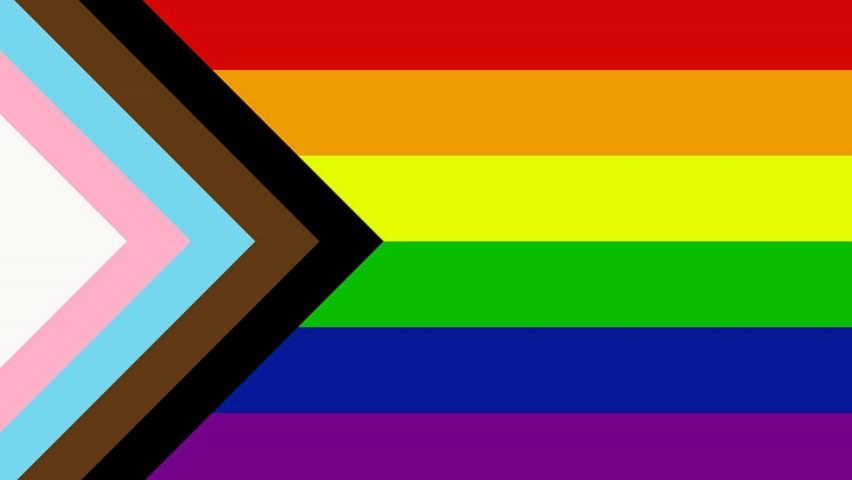
Big shout out to graphic designer Daniel Quasar on adding a five-coloured chevron to the LGBT Rainbow Flag to place a greater emphasis on “inclusion and progression”

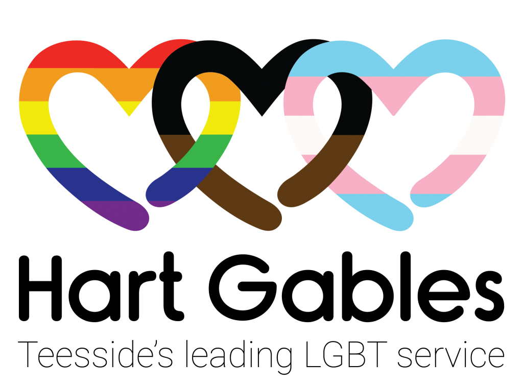
We here at Hart Gables have followed in Daniels footsteps and our very own graphic designer Sian Parker has re-created our logo to include black and brown colours that represent marginalised LGBT communities of colour.
Similarly, we have incorporated the colours pink, light blue and white to represent our trans+ community.

As we see logos becoming more inclusive throughout the UK we are proud to stand as the first LGBT+ charity in our area to incorporate permanent colours of inclusion and progression.